
Responsive Web Design: The Importance of Functionality on all Screen Sizes.
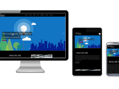
Does your website render properly on all screen sizes from cell phones to TVs? To compete in today's world, your website redesign should be high on your list. You need to be able to reach your customers anywhere, anytime.
Does your website render properly on all screen sizes from cell phones to TVs? As you prepare to make long-delayed investments in your business, put website redesign high on your list to reach consumers via their phone, tablets, PCs TVs … and soon … refrigerator doors, bathroom mirrors and more.
In a nutshell, Responsive Web Design (RWD) is a best practices way to develop websites where content automatically resizes and reflows, regardless of device or orientation, providing a better navigation experience for visitors. A company's website is most likely the first impression by a new customer. It's important to appear seamless on any device. With the proliferation of new tablets and mobile devices, mobile has become the preferred method for internet surfing. Customers want a complete experience of your website from the device they have chosen. Unhappy visitors will quickly leave a site if they're unable to view a full website easily.
Without getting too technical, RWD is accomplished by implementing fluid grids and flexible images. Elements are sized with percentages rather than fixed pixel sizes. This approach provides the ultimate viewing experience with limited scrolling or panning. Your website development team can optimize your website and content to achieve RWD in a variety of platforms, including Microsoft Azure, Linus and Windows IIS. Industry-leading Content Management Systems include Sitecore, Sitefinity, Drupal and WordPress.
To illustrate the importance of RWD, Google has established protocols to rank websites based on their responsiveness. As the standard for search engines, Google is leading the way to ensure searches are productive and relevant to the user. If a site is not mobile-friendly, it will rank much lower in the search. By implementing your website using an RWD approach, your site is much more likely to rank higher by Google, not to mention Bing and other search engines — greatly increasing your SEO (Search Engine Optimization).
As the millennial generation continues to march their way up the ladder in the work force, the need for mobile friendly websites is an increasingly important requirement of doing business — both to attract new customers and to offer the best experience to current customers.